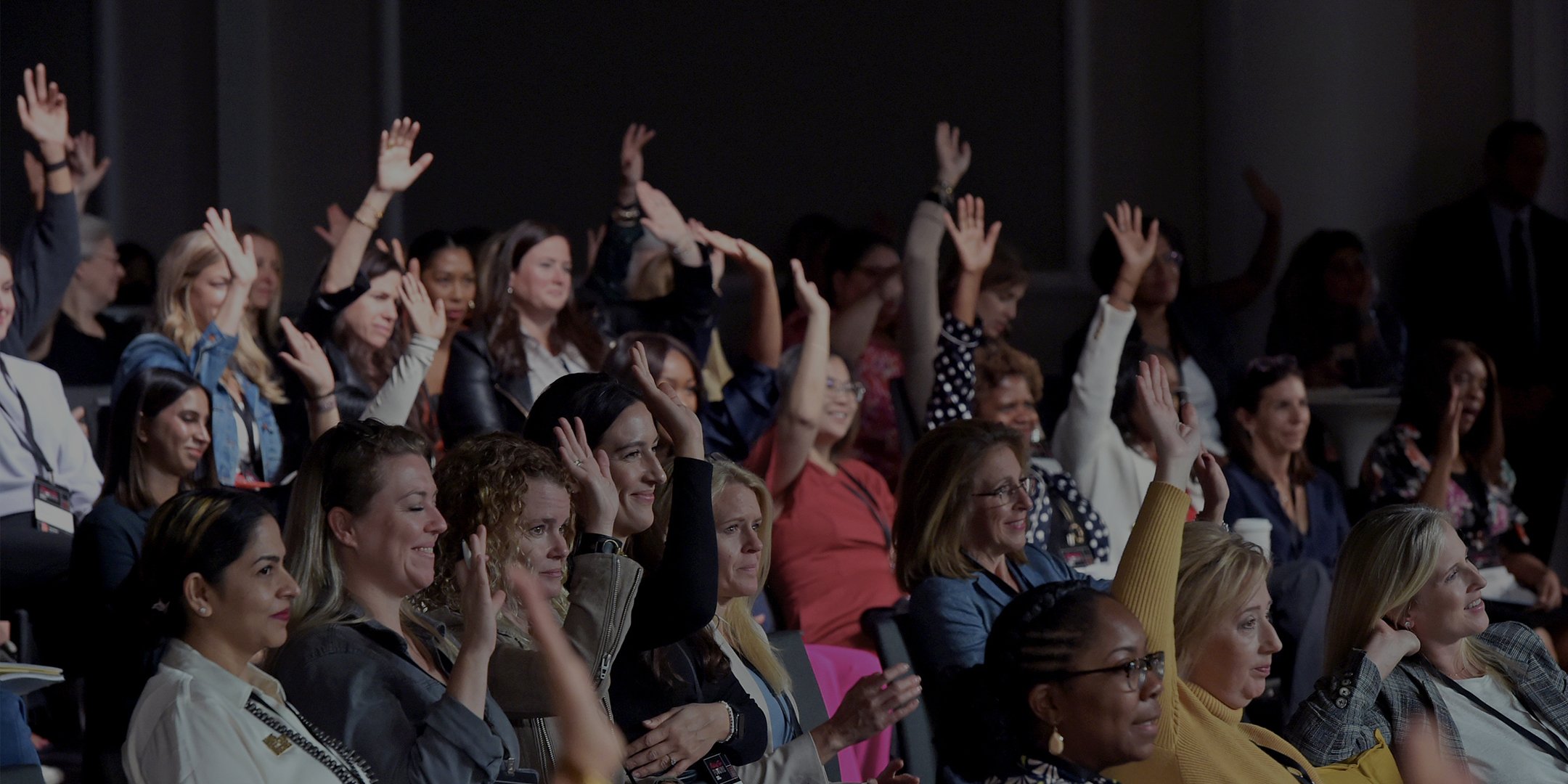
Accelerate equity for women in the workplace and beyond.

Summary
⛳️ Goal
Revamp MAKERS website to be an editorial resource for women professionals & Foster a more exclusive community, by highlighting both the perks of being a member and information about how to get involved.
💪 Role
Lead designer - UX, UI, Prototype
🧑🤝🧑 Team
2 designers, 1 product manager, 1 developer & an editor team
🗓️ When
2023-2024 (Launch)
🚀 Deliverable
✔︎ New MAKERS responsive website
✔︎ A content guideline for editorial team

Background
MAKERS is a media and community-focused brand that exists to accelerate equity for women in the workplace and beyond by forging purposeful partnerships and sharing stories that ignite passion, drive action, and make change.
MAKERS use our platforms to create access to important stories from diverse voices — incredible people who create change and inspire us to collective action.
Challenge
MAKERS has a strong social community (447K Instagram followers, 13.5K subscribers) and partnerships. However, its previous website showed low user engagement - the site that existed under Yahoo Lifestyle did not live up to its full potential to foster that community.
Final Objective
Revamp MAKERS website as an editorial hub for women professionals. Provide curated content that aligns with their values and foster an exclusive community through membership benefits and engagement opportunities.
Design process
Define site structure & create wireframes to discuss user journeys
Analyze competitors' patterns and benchmarks
Set redesign direction through innovation spectrum analysis
Create high-fidelity prototypes of varying innovation levels for stakeholder alignment
Handoff design specs to development team
Define: Structure
As the project kicked-off, I drafted the information architecture for our new site. The new site has 6 pages:
Discover (Landing page) : featured articles, and entries to subpages
Watch: MAKERS original video series, and entries to subpages
Conference: information of MAKERS annual conference
Members (Private): information of member-exclusive events
Partnerships: partnership benefits and contact information
About us: MAKERS brand story
Define: Userflows
I used low-fidelity wireframe & prototype to walkthrough userflows with product managers and developers.
Research: Competitor Analysis
I led a competitor website analysis. Through this research, our team identified the opportunity to differentiate MAKERS through bolder, dynamic design that truly reflects its brand spirit.
Pivot: Push the boundaries further
To pursue a bolder direction, I guided the team to explore innovative visual directions, analyzing high-quality websites to define our unique approach.
Alignment: Visual Direction
I leveraged the Innovation Continuum framework and benchmarks to align stakeholders on our redesign's innovation direction
Concept: Explorations & Prototype
I developed four concepts and high-fidelity prototypes for different innovation levels, guiding stakeholders to align on the final design.
Concept 1: Makers Soulmate
The first concept builds upon MAKERS' existing visual identity, bringing a feminine feel through curved patterns and serif typography.
Concept 2: Makers Magazine
The second concept emphasizes MAKERS' editorial content, creating a modern feel through grid-based layouts and subtle rounded corners.
Concept 3: Flora in Parallax
The third concept highlights MAKERS' digital experience, creating a dynamic feel through parallax interactions, floral-inspired details, and bold sans-serif typography.
Concept 4: Makers Shows
The fourth concept represents MAKERS' most daring vision, creating an audacious feel through dramatic interactions and vivid, saturated colors.
Final Direction
After stakeholder alignment, we landed on a hybrid solution combining Makers Magazine's editorial aesthetics with Flora in Parallax's interactivity. This approach streamlines content production by enabling our editorial team to seamlessly integrate high-quality original and social media content.
Design Specification
I delivered a detailed Figma specification documenting all page components and interactions.
Editorial guidelines
In addition to the design specification, I created a content guideline that demonstrates best practices for title treatments and image usage for the editorial team.
🚀
Design Delivery
Six months after project kickoff, we launched the new responsive MAKERS website in March 2024.
* As requested by the MAKERS brand team, we updated the background color from red to black.


