Turn off the light, It’s dark theme!
Design systems built for better cross-functional collaborations.
Summary
⛳️ Goal
Build a new design system for Taiwan Yahoo App in dark mode
Lead designer - Design System & Specifications
💪 Role
Collaborated with one visual designer, 1 product manager, 4 developers.
🧑🤝🧑 Team
🗓️ When
2019 Q1 - Q2
✔︎ Delivered cross-platfom dark theme design guidelines, documentations, and a full set of component libraries
✔︎ Establishing clear cross-team processes that teams found "systematic and easy to execute".
🏆 Outcome
Adopt dark mode for better reading experience
Background
To support Yahoo App's dark theme initiative in 2019, I collaborated with developers to transform our color system into a scalable solution, improving team communication and reducing maintenance efforts.
✔︎ Better text readability
✔︎ Better contrast
✔︎ Reduce eye fatigue
✔︎ Save battery life
✔︎ Better text readability ✔︎ Better contrast ✔︎ Reduce eye fatigue ✔︎ Save battery life
Five teams, single guideline
Challenge
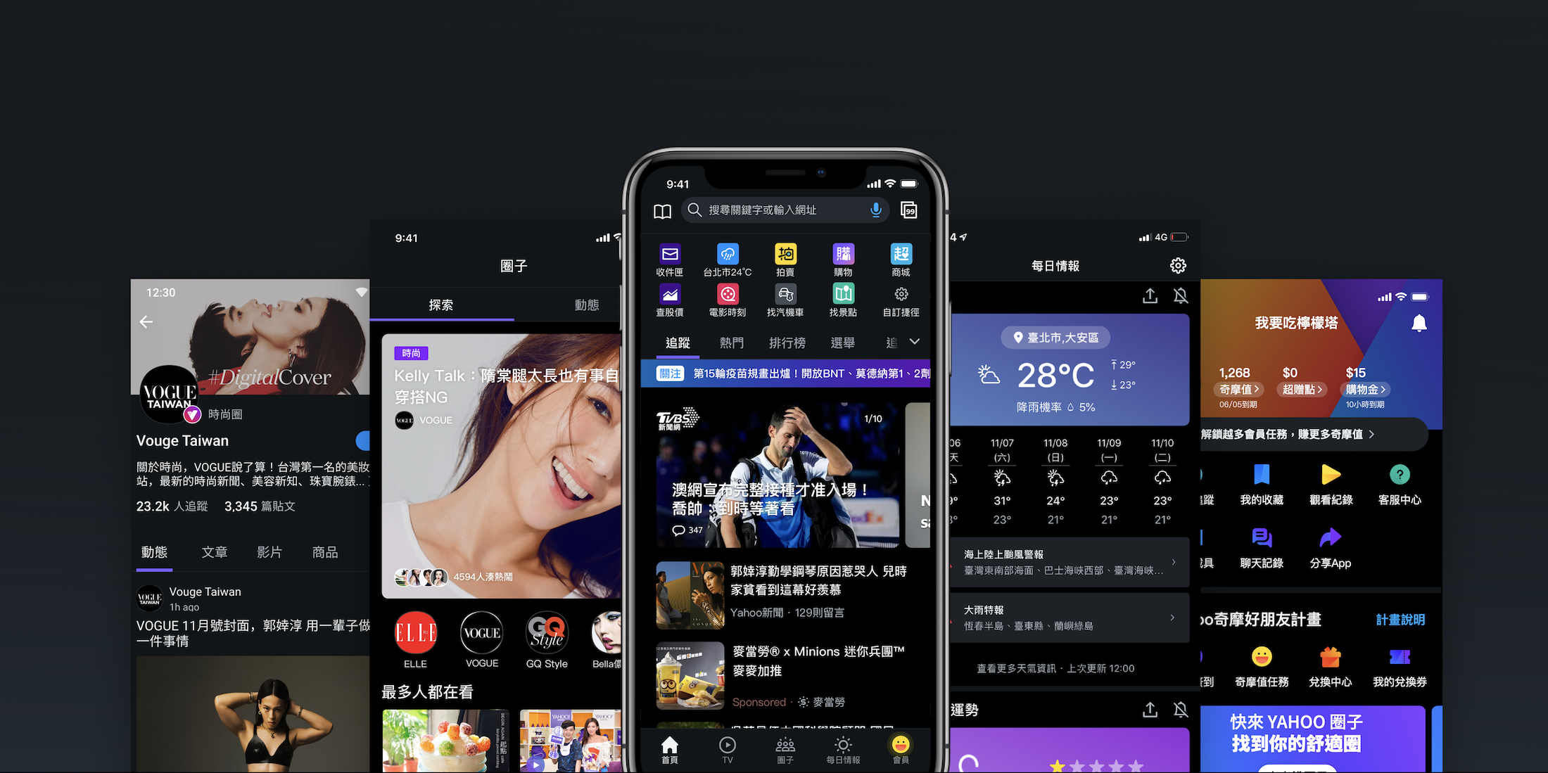
Yahoo App combines five key features: news, video, communities, daily information, and loyalty program. Each feature has its own visual style and dedicated team of developers and product managers.
To implement dark mode across all pages effectively, we explored a design system that enables developers and designers to collaborate smoothly.
Taiwan Yahoo App: Video, community, news, daily information, loyalty program (Left to right)
How might we
Build a scalable design system that foster collaboration and streamline maintenance for the team?
Design guidelines are the team's common language and the tool for effective communication. Therefore, it should be built on shared alignments.
Design process
Reviewed all pages and clarified the app structure and tiers of information.
Created document to list all the pages, confined project scope and schedule with Project Manager.
Explored color palette and designs using the App's key screens.
Shared early concepts with development teams and discussed their implementation plan.
With feedback from PM and devs, defined detailed design specs and the guideline.
Tested implementation result with demo apps, iterated and finalized the design system.
Review, define, and prioritize
First, I reviewed Yahoo App’s information architecture and prioritized deliverables by the impact on user’s experience across the app. Web views and more pages under the third tier were excluded from the first phase, as users rarely visit these destinations.
Design deliverables priority
Shared components
First-tier: App landing pages
Second-tier: listing pages
Third-tier: detailed page
Use information architecture to confine design scope
Define design principles
Consistent
Apply the same rule and color palette across the iOS / Android Apps and mobile webpage.
Minimum
Use color only when it provides meaning; Otherwise, use a monochrome palette. & Use the same assets in light/dark themes.
Easy to maintain
Build up a color-style system that can be extended or easily applied to future projects.


Use same asset in both light and dark mode
Define design guidelines
Design guidelines provide a clear set of standards for everyone to follow. Instead of specifying design elements page by page, I establish general rules for reusable components and ensure accessibility and inclusivity by checking color contrast.
Define background colors in a layer structure
Check the color contrast to ensure accessibility
Iterations on design documentations
Since the project kick-off, I discussed with developers and took their feedback during iterations. After 3 rounds of iterations, I decided to use a spreadsheet to build our new design system, enabling real-time access and version tracking for internal teams and external collaborators.
Version 1
Two color palettes for light and dark theme
Con
It is time-consuming to switch between light and dark mode design guidelines and hard in comparison.
Version 2
Combined light and dark theme guidelines into a single file
Con
Color settings required frequent updates during iteration, making it difficult for developers to identify changes and update them in time.

I built the design system on spreadsheets, enabling real-time access and version tracking for internal teams and external collaborators.
Final Version
Result & Impact
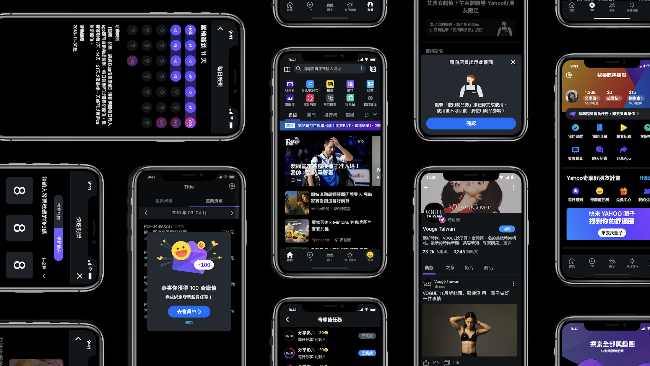
Other apps/services adopted this dark theme systme
✔︎ Created the first dark mode design system for Yahoo Taiwan, setting a standard for other product teams.
✔︎ Documented and shared our design system, enabling Shopping, Auction, and Mobile Search teams to develop their dark themes.
✔︎ Created a feasible design system through close developer collaboration, ensuring smooth implementation across teams.